An old management cliché states, "You can't manage what you don't measure". This phrase couldn't be further from the truth. Without monitoring work progress regularly, it's challenging to identify necessary changes or determine if everything is progressing smoothly.
At Businessmap, we firmly believe that tracking progress is the core of continuous improvement. Given the power analyzing work performance tools hold, our platform is recognized for its comprehensive yet easy-to-use Analytics module.
The module contains an extensive and powerful set of Lean/ Agile charts that give users a good overview of the workflows' performance while providing insights into opportunities to optimize process efficiency and spot potential bottlenecks.
Without further ado, let's examine 5 key kanban charts for tracking progress in a flow-based work environment, their benefits, and easy-to-follow implementation.
- Cumulative Flow Diagram (CFD)
- Cycle Time Scatter Plot
- Aging WIP Chart
- Block Clustering Chart
- Flow Efficiency
What Is a Kanban Chart?
Kanban charts are graphic tools that provide a visual representation of summarized data about the performance of a workflow based on selected metrics such as cycle time, lead time, throughput, or work in progress.
The analytics charts automatically track and save data gathered from every action executed on your work management board. This data lives in your system, providing instant insights into the productivity, efficiency, and reliability of your work processes. The purpose of using the charts is to provide you with valuable information and help you make better data-driven decisions.
Note: Remember, don’t mistake kanban charts with kanban boards and kanban metrics. Kanban boards are visual management tools used to organize and manage work, while kanban metrics measure work performance and inform where the team can improve by providing statistical data. You can think of the charts as easy-to-use graphics that demonstrate the result of the continuous use of kanban boards and analyzing how work passes through the boards using metrics.
The Importance of Kanban Charts
Keeping track of critical metrics is fundamental for a company’s success and growth. Analyzing work performance is essential to ensure work process stability and build efficient and productive teams.
Using kanban charts helps you understand the health of your system, provides a shared understanding of the work, and enables teams to adapt their processes based on real-time feedback and insights. With kanban charts, you can easily spot bottlenecks early in the process and immediately act accordingly to resolve any blocker, prevent generating extra costs, or experience delayed deliveries.
Another significant trait of kanban charts is that they provide greater predictability. By monitoring crucial lean metrics, you can forecast when and how long it will take for your team to complete a project, allocate resources efficiently, and set realistic deadlines – all based on accurate data accumulated from your work system.
At the end of the day, it is wrong to consider kanban charts as just numbers or lines connecting dots on a graph. Kanban charts answer questions related to process optimization and how to deliver customer-centered value faster and improve continuously.
What Are the 5 Easy-to-read Kanban Charts?
Due to the wide range of advantages teams can reap from using kanban charts, most modern project management tools are equipped with robust analytics packages that offer valuable workflow metrics.
Let’s delve into the most specific charts you can use to measure success and run a smooth process system.
1. Cumulative Flow Diagram (CFD)
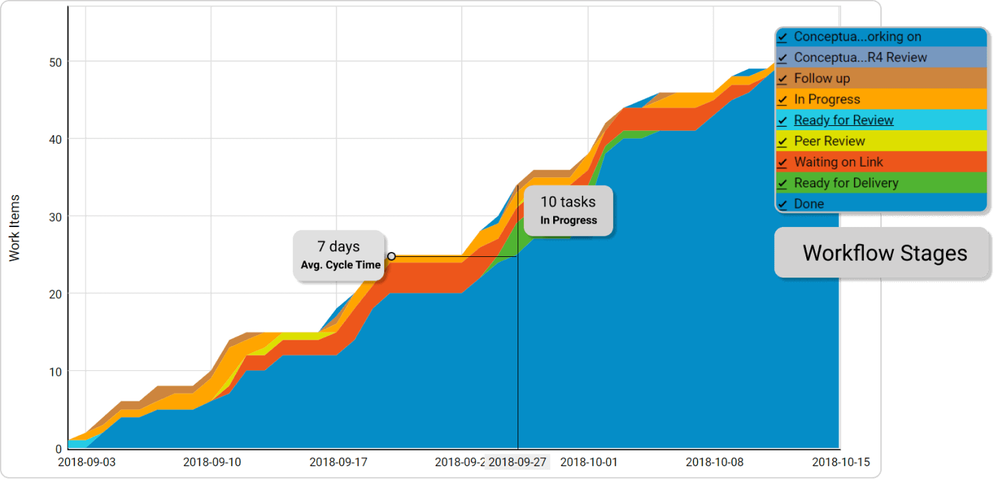 Cumulative flow diagram
They say every complex thing consists of multiple simple parts. I'll try to apply this method here by decomposing the diagram into several parts.
- The first thing to understand here is what we are measuring; hence, try to examine what the values plotted on the axes are. In our case with the CFD, this is time against the number of tasks. So, on the vertical line can be found the number of tasks in absolute value and on the horizontal - a timeline. The bottom line is that we are measuring whether tasks are increasing or not over time.
- Second, there are different flows. Each colored flow represents a column on the board. If we isolate only one flow, we will get a look at how many tasks this particular column contains over time.
- The third part is the accumulated data of all flows representing individual kanban columns. This is where things can get messy. However, when we look at this kanban chart with our end goal in mind - see how the progress of finished tasks is flowing over time - it gets a little bit clearer. This accumulated look over the data gives us overall information on how we are performing.
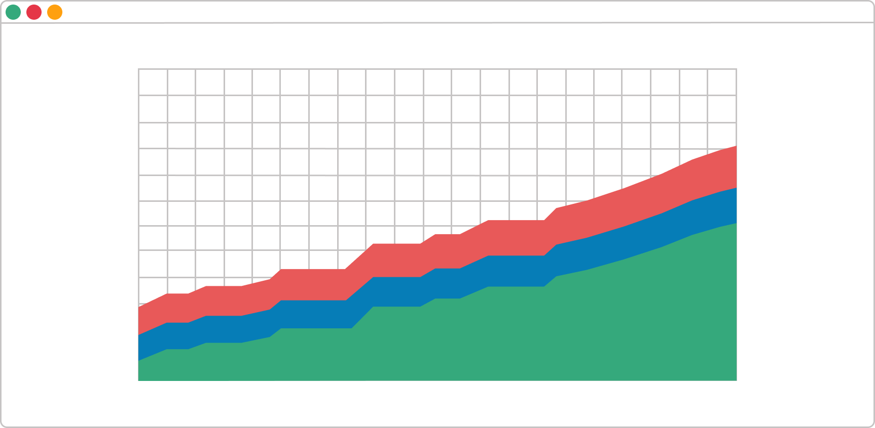
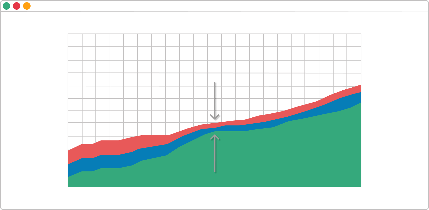
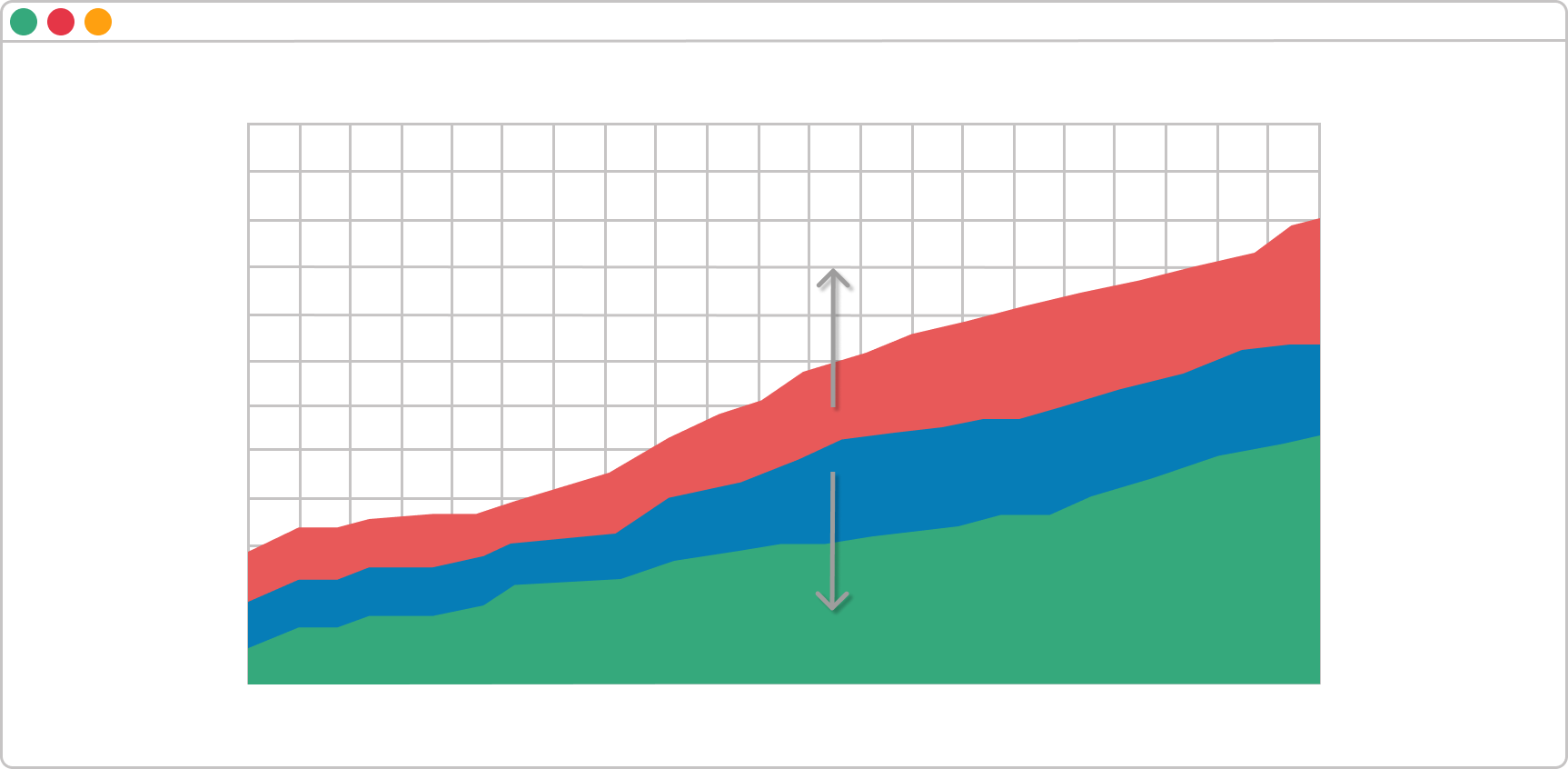
As I mentioned above, the Cumulative flow diagram, in a nutshell, gives us overall information on how we and our team is performing. When we isolate the requested and in-progress states, we can get instant feedback about our workflow. When the rule of ceteris paribus is applied, there are three possible scenarios here:
Scenario A. The Bands Are Progressing in Parallel
This means your workflow is stable and you are processing the same number of tasks that you are getting.
Scenario B. A Band Is Rapidly Narrowing
This means throughput is higher than the entry rate. In other words, you've got more capacity than you need.
Scenario C. A Band Is Rapidly Widening
This is a sign that more tasks are entering the system than leaving it. It usually means that your team is multitasking a lot or doing other non-value-added activities.
These are just a few example scenarios, and of course, the situation could be way more complex with many factors involved. Still, these are the three ways your diagram can be learned to help you track the progress of work items inside your process.
2. Cycle Time Scatter Plot
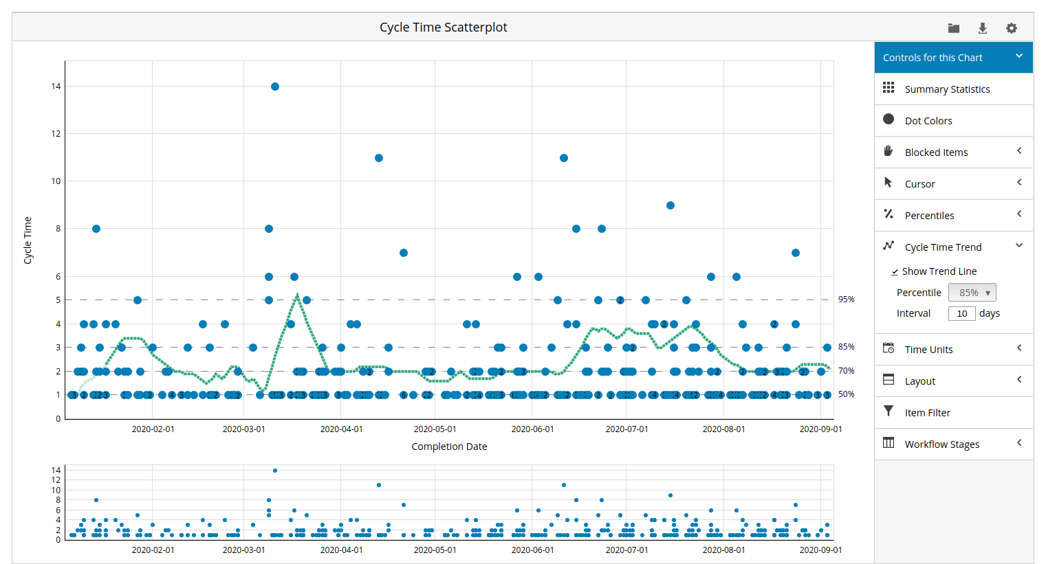 Cycle time visualization on a Cycle Time Scatterplot
Before we dive deeper into this graphic, let's first define what "cycle time" and "lead time" is.
Cycle time is the time you need to complete something you have started working on, and Lead time is the time between something being requested and being delivered. In the context of Lean, cycle time contains only the "in progress" state, while lead time contains all three states (requested, in progress, and done).
Sometimes, the lead time contains multiple cycle times. Although the chart is called "cycle time," it could also represent the whole lead time if you decide to include the backlog, requested, done, and archive stages in the work process.
After we have defined the two terms, let's examine the cycle time scatter plot that Businessmap has to offer, how to read it, and how it can help you track progress.
Similar to CFD, we'll start by explaining what the values on the axes are. In this case, the axes represent accumulated cycle time against the exact completion date of each work item. When you hover over the blue dots, you can see in which workflow stages the given task spent the most time.
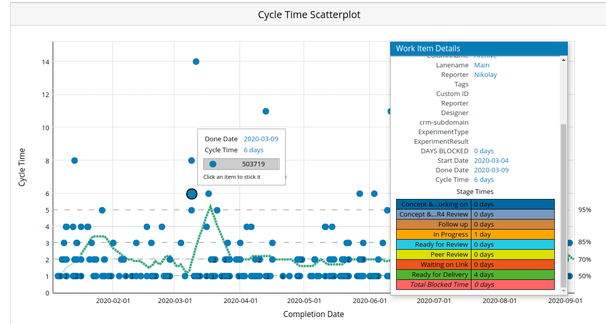 Work items detail visualization on a Cycle Time Scatterplot
This gives you valuable data as you can understand where a given work item significantly slowed its progress, for example. As a result, you can investigate any root causes for that, especially if you notice a trend in a particular work stage.
The cycle time scatter plot is an extremely useful chart for track progress and understand the probability that a given task will likely exit the workflow. . Using the percentage data on the right of the chart above, you can communicate an SLA (Service Level Agreement) with your customers that, on average, it will take 3 days for a work item to be completed with an 85% certainty.
Furthermore, the chart allows you to spot a trend (the green line) as well as outliers in your process. This enables you to investigate them and take respective actions, if necessary quickly.
3. Aging WIP Chart
![]() Visualization of aging work in progress using the Aging WIP Chart
Visualization of aging work in progress using the Aging WIP Chart
The Aging WIP Chart is one of the most significant charts for tracking progress. It gives you an excellent overview of your entire process, and unlike the cycle time scatter plot, it provides data for tasks that still need to be finished.
With the help of the Aging WIP chart, you can analyze how your tasks age and progress through your workflow. You can clearly see the stages where work items go through the most and investigate causes in case you notice an unusual piling up of kanban cards in any of the columns.
Something very important for this chart is the pace percentiles (on the right) and the age in days (on the left). The data shows you the pace at which your tasks have historically moved through the workflow. This gives you a quick overview of current outliers in the process, so you can take any necessary measures to stabilize your cycle time before it goes out of hand.
4. Blocker Clustering Chart
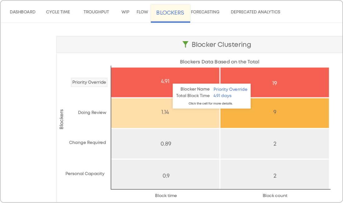 Blocker Clustering chart
We use the Blocker Clustering chart to measure blocked time. It shows you what are the most common blockers in your process and how much time the blockers have taken up. By monitoring the chart regularly, you can measure and mitigate the impact of the impediments to your process, resulting in better flow efficiency.
5. Flow Efficiency
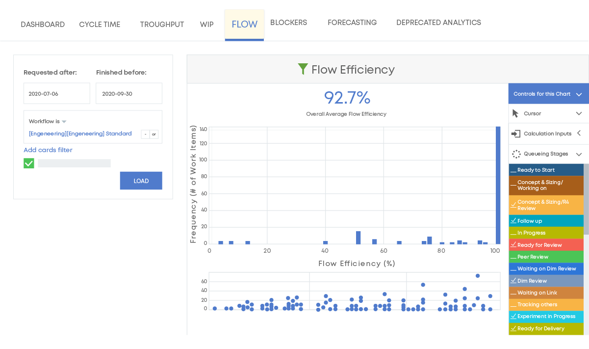 Flow Efficiency chart
You can visualize active and non-active stages in your process using a Kanban system. In Businessmap, for example, non-active stages are designated as "queues," which means they are idle and awaiting someone or something else. We use the flow efficiency chart to monitor how efficiently our teams can process work via active and queuing stages. As a result, we can spot issues promptly and resolve them as soon as possible.
(Bonus) Supporting Tools to Monitor Progress in Businessmap
To reap the full potential of your flow-based system and make accurate data conclusions, among the charts mentioned above, Businessmap offers more helpful additions for tracking the progress of your work.
Kanban Timeline
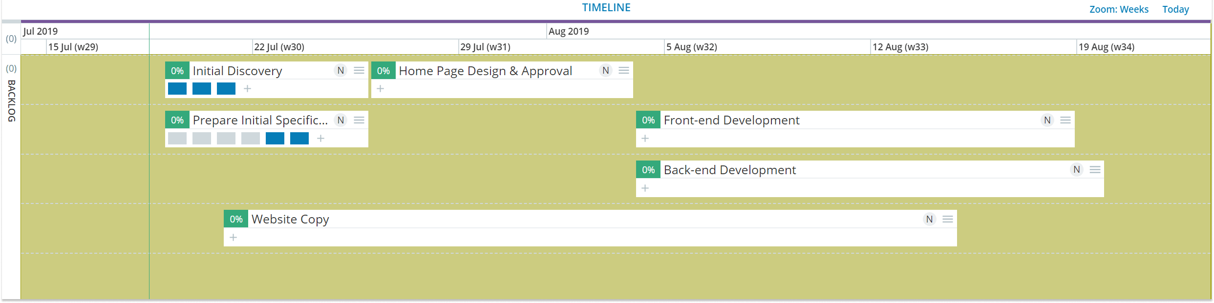 Projects' visualization using the Timeline functionality
In Businessmap, for example, we use the timeline on a kanban board to monitor the progress of team initiatives (Agile epics) or even entire projects in real time. When the Kanban cards/tasks move through the workflow and get completed, the status of the team initiative (to which the work items are related) is immediately updated on the timeline.
This allows you to see briefly how big pieces of work as well as the smaller parts that constitute them, are progressing over time. As a result, you can eliminate the need for constant status reporting and focus on the work that matters.
Predefined Widgets
In Businessmap, widgets provide summarized information about your projects and shortcuts to your work management boards. Designed to help managers gain a performance summary across teams and workflows, widgets track vital metrics and aspects that are necessary for your processes.
Workflow Performance Summary Widget
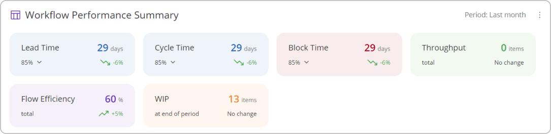
The primary purpose of the Workflow Performance Summary widget is to provide you with an instant overview of your most essential flow metrics, including cycle time, lead time, block time, throughput, flow efficiency, and WIP.
With just a glance, you can monitor how stable and efficient your processes are. In addition to that, the widget allows you to analyze and compare each workflow’s performance separately from previous periods. This helps to understand whether work is improving over time and if any necessary actions are required. With this valuable data, you can easily make data-driven decisions and discover optimization potential.
Process Efficiency Widget
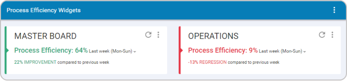 Analyzing a process flow using the Process Efficiency widget in Businessmap
Without a doubt, process efficiency is among the most important metrics to keep an eye on. It refers to how well processes are executed considering the resources and time consumed. To keep your operations optimized and increase your team productivity level, tracking this metric is crucial to gaining instant insights into how things are done.

Bisser Ivanov
Co-founder and COO
Keen on innovation, exploration or simply trying new things. Would that be a technology, new methodology or just cool gadgets. Got almost 2 decades of experience working as a software engineer, team lead, QA/ processes manager and managing director in mid-size and large-scale software companies: ProSyst, SAP, Software AG.