The metrics in Agile project management are one of the main aspects that transformed how knowledge work teams measure their projects’ progress.
Agile metrics are performance indicators related to outcomes that allow teams to reflect on their process and make data-driven decisions for future actions.
To begin our discussion of Agile project metrics, let's first see how they differ from the traditional ones.
What Are Agile Metrics?
Agile metrics are measurements used to evaluate and monitor the progress, performance, and effectiveness of Agile project management. These metrics include cycle time, lead time, throughput, work in progress, work item age, flow efficiency, blocked time, and more.
Agile metrics provide insights into the project's health, help identify areas for improvement, and enable teams to make data-driven decisions to deliver high-quality customer value.
What Are KPI Metrics in Agile?
KPI metrics (Key Performance Indicators) in Agile are specific measurements used to track the progress and success of Agile projects. These metrics are used to evaluate the performance of Agile teams and provide insights into areas where improvements can be made.
KPI metrics in Agile typically include metrics like cycle time, lead time, throughput, work in progress, work item age, flow efficiency, blocked time, and team morale. These metrics help Agile teams to continuously improve their processes and deliver high-quality products to their customers.
Traditional vs. Agile KPIs
The main difference between traditional and Agile performance metrics is that the former focus on output while the latter on outcomes. Many traditional project management KPIs can provoke teams to take wrong actions in project management on all levels.
For example:
- Quality is measured by the number of documented requirements instead of collaborating with the customers to determine if they are satisfied with the results.
- Productivity and progress are measured only by tracking planned hours vs. the baseline without considering the team's actual capabilities.
- Performance is measured by how fast you can deliver, even if these are the wrong things to deliver.
When discussing the highly volatile world of knowledge work, measuring metrics traditionally won't help teams finish projects faster but may amplify the pressure.
That's why, with the vast adoption of Agile project management, new Agile metrics for reporting have emerged. They are meant to help you better analyze and understand your workflow, discover flaws, and improve so your team can focus on satisfying customers through the continuous delivery of value.
The 3 Types of Agile Metrics
The three most commonly used types of Agile metrics include:
-
Lean metrics: Focus on eliminating wasteful activities and providing a flow of value from the organization to its customers. Key Lean metrics include lead, cycle time, and throughput.
-
Kanban metrics: Focus on organizing and prioritizing work, workflow, and getting it done. Key Kanban metrics include cycle time, throughput, and work in progress.
-
Scrum metrics: Focus on the delivery of working software to customers. Key Scrum metrics include velocity and planned capacity.
How to Use the 6 Agile Metrics to Boost Work Delivery?
1. Lead and Cycle Time
Lead and cycle time are two essential Agile project metrics that have their beginnings in the Lean management world. Both show you how long work items spend in a given process. However, there is also a clear differentiation between them.
Lead time shows you the total time (including wait time) a work item spends in the entire process from the moment it is requested to the time it is delivered.
To give a short example of this Agile metric, let's say that a customer of yours has requested a service or a feature for development. From the moment you commit to delivering the given service/feature, lead time starts accumulating, even if you haven't started working on it yet. An easy way to think of lead time is as the "customer timeline."
In Agile, cycle time starts accumulating once you begin working on the requested item. In other words, with cycle time, you can measure how many hours/days someone actively worked on a task to complete it. This allows you to track the duration of all the work items in a project and eventually use that as input to make better forecasts for project completion. As opposed to lead time, you can think of cycle time as the "team timeline."
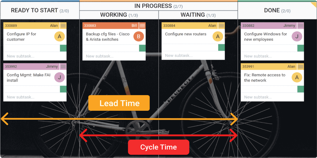
Tracking the lead and cycle time metrics is easy with the help of a Kanban board. You can visualize when a work item is committed for execution and when the actual work begins. This usually happens with the "Ready to Start"/" Requested" and "In Progress"/" Working" columns on your Kanban board, as seen from the image below.
 Visualization of lead and cycle time on a Kanban board
2. Throughput
In Agile, throughput measures the average number of work items processed per unit of time.
In a Kanban system, for example, as work is visualized in cards, throughput is measured based on how many Kanban cards were finished in a given period (weekly, monthly, etc.)
Here we should briefly mention that many teams believe that throughput is pretty much another word for productivity in Agile. While they are very close, throughput measures how many work items teams can complete in a specific time frame, while productivity is more about efficiency.
In general, throughput is one of the most crucial Agile performance metrics. It gives you great details into your team's real capabilities, so you can better plan how much work you can deliver in a given period. Combining average throughput and cycle time can become the secret weapon for any team looking to improve their project delivery's predictability.
To measure the throughput of your team week-by-week, you can use the Throughput Run Chart. There, you can see how many work items teams can complete, analyze their average throughput, and use that as input for future planning activities.
Visualization of the throughput metric using a Throughput Run Chart
3. Work In Progress (WIP)
Work In Progress is another one of the most important Agile metrics. Work in progress shows how many work items you currently have "in progress" in your working process.
WIP is a critical Agile KPI to keep track of because any unfinished work represents sunk costs. This also results in multitasking, which hinders the team's throughput.
That's why Agile teams look to limit their work in progress, which ensures that any work started will be finished as soon as possible, and thus the team's throughput will increase. Limiting work in progress has a positive effect on cycle time by decreasing it.
The best tool for visualizing WIP is the Kanban board. There, you can also set corresponding limits on your work stages to ensure that only a certain number of tasks can reside in every Kanban column.
Visualizing WIP limits on a Kanban board
Doing this will allow you to focus your attention on the most critical tasks and make sure that you release value to the market more frequently.
10 Years Kanban Experience In 1 Free Book.
Project Manager's Guide to Kanban
4. Work Item Age
Work item age (aging work in progress) is the amount of time that passed between a work item that was started and its current time.
This Agile project metric is a relevant leading indicator only for non-finished work items. It complements the cycle time, which is a metric appropriate for finished work items.
The work item age metric has mainly two uses – first, it indicates how your current tasks are moving forward, and second, it gives you a clear idea of how you were performing in similar contexts in the past.
Measuring aging work in progress is crucial in a knowledge work environment because you can see how your tasks progress through your workflow. This shows you in which stages of the process tasks reside the most and how long, on average, any emerging work items are expected to age.
Combining this information with cycle time data will allow you to make valuable data-driven decisions to optimize your workflow to better meet customers' delivery expectations.
To visualize all of that information, you can use a powerful measurement tool called the aging work-in-progress chart.
Visualizing work in progress using the Aging Work in Progress chart
5. Flow Efficiency
Another one of the highly important Agile project metrics is flow efficiency. It shows you how efficiently you can process work from start to finish.
To calculate flow efficiency, you need to divide the value-added time by the total work time, including stages where no active work is done.
This Agile metric works perfectly in a Kanban system where you can visualize both active and non-active stages in your process. At Businessmap, for example, we mark the non-active stages as "queues" on our Kanban boards, which means that work sits idle there and is dependent on someone/something.
With the help of the flow efficiency chart, our teams input active and queuing stages to monitor how efficiently they can process work regularly. This helps you spot issues promptly and resolve them as soon as possible.
Using the Flow efficiency chart to visualize workflow efficiency
6. Blocked time
In an Agile environment, as everything is visible, work that cannot be moved forward for some reason should be visible too. In a Kanban system, for example, such items are marked with a "blocker" sticker.
Work item blocked on a Kanban board
A blocked card usually means a task is waiting on an unforeseen event or dependency which is hindering the assignee from proceeding with the work.
A blocked card on the Kanban board signals to all team members that the given work item needs immediate attention to resolve the blocker. Therefore, tracking blocked time is a valuable Agile metric.
To measure blocked time, we use the Block Clustering chart. It reveals the most common blockers in your process and how much time work has been impeded by specific blockers. Regularly monitoring the chart allows you to gauge the impact of your process impediments, so you can progressively mitigate them and, as a result, optimize your flow.
Analyzing process blockers using Blocker Clustering chart
Cumulative Flow Diagram (Bonus)
The cumulative flow diagram (CFD) is not a metric. However, it is one of the best agile tools to measure:
- Lead time and Cycle time
- Throughput
- Work in progress
These are all agile flow metrics, which we have already discussed above.
The CFD is a graphical representation of your WIP flow in a Kanban system. With the help of this chart, you can understand the state of your work in progress and analyze the stability of your workflow - the entry and exit rate of your work items.
What you will see on a CFD are color blocks representing the work stages on your board, and the width of those blocks represents the number of cards in it.
Cumulative Flow Diagram visualizing workflow stages, average cycle time, and the number of work items in progress
The cumulative flow diagram provides clear visual signals of where process bottlenecks may be forming. With such an overview, you can then investigate why they have formed and how to can improve the workflow.
What’s the Importance of Agile Metrics?
Agile Metrics are important because they allow teams and organizations to measure progress and performance in their Agile projects. These metrics help teams identify improvement areas, track Agile practices' success, and make informed decisions about how to optimize their processes.
By using Agile metrics, teams can get a better understanding of the value they are delivering to customers, improve their delivery speed, and increase the quality of their products. Overall, Agile metrics provide a way for teams to improve and deliver better outcomes continuously.
What Are the Qualities that Make Agile Metrics Powerful in an Agile Environment?
In an Agile environment, the efficacy of metrics is paramount as they serve as a crucial tool for teams to facilitate learning and enhance processes. Metrics with specific characteristics have been proven instrumental in driving constructive development within Agile teams.
The following are qualities that make Agile metrics powerful in an Agile environment:
-
Relevant: Agile metrics should be relevant to the team's goals and objectives. They should align with the project's vision and help measure progress toward achieving that vision.
-
Actionable: Agile metrics should be actionable, providing insights that the team can act upon to improve performance or adjust their approach.
-
Timely: Agile metrics should be timely, meaning they should be updated frequently and in real-time so that the team can respond quickly to project direction or performance changes.
-
Accurate: Agile metrics should be accurate, meaning they should be based on reliable data and calculated using consistent methodologies.
-
Transparency: Agile metrics are transparent and accessible to everyone on the team. This allows for open communication and collaboration, which is essential for agile development.
Agile Metrics Frequently Asked Questions (FAQ)
How can Agile teams use metrics to improve their performance and identify areas for improvement?
Agile teams can use metrics to improve their performance and identify inefficiencies, bottlenecks, and areas for improvement by tracking and analyzing data related to their project progress, team productivity, and customer satisfaction. This helps them to continuously optimize their performance and deliver higher value to their customers.
How do Agile metrics help stakeholders track progress and make informed decisions about resource allocation and project priorities?
Agile metrics provide stakeholders with objective and quantitative data related to the progress and performance of a project. Agile metrics help stakeholders track progress, identify areas of improvement, and make informed decisions about resource allocation and project priorities.
By analyzing these metrics, stakeholders can determine if the project is on track to meet its goals, identify potential risks or delays, and adjust priorities and resource allocation accordingly. This helps ensure that resources are used efficiently and project priorities align with the overall business objectives.
What role do Agile metrics play in fostering a culture of continuous improvement and innovation within an organization?
Agile metrics play a vital role in fostering a culture of innovation and continuous improvement within an organization by providing insights and feedback on the performance of the development team and the effectiveness of the Agile processes.
By tracking metrics such as cycle time, lead time, throughput, work in progress, work item age, flow efficiency, and blocked time, teams can identify areas for improvement, optimize processes, and make data-driven decisions to improve the quality and speed of their work continuously.
This promotes a culture of experimentation and enables teams to innovate and deliver value to customers more effectively and efficiently. Additionally, by openly sharing and discussing metrics with stakeholders, teams can encourage transparency, collaboration, and a shared commitment to continuous improvement.
We offer the most flexible software platform
for outcome-driven enterprise agility.
In Summary
Agile metrics will help you analyze and understand your workflow, discover flaws, and improve, so your team can focus:
- on satisfying customers
- on continuous delivery of value
- on eliminating wasteful activities


 Visualization of lead and cycle time on a Kanban board
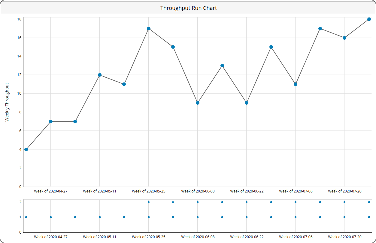 Visualization of the throughput metric using a Throughput Run Chart
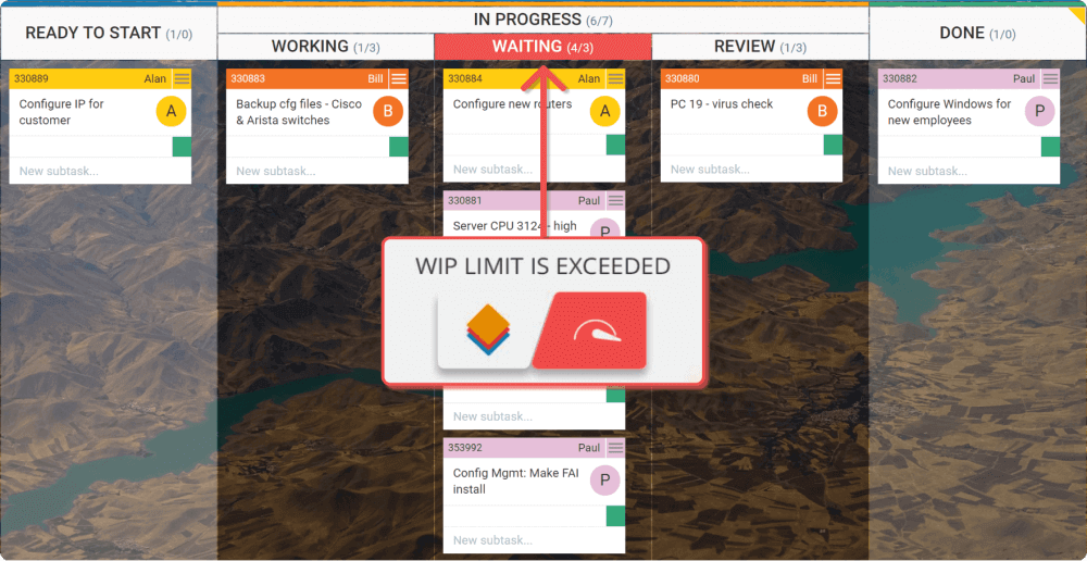 Visualizing WIP limits on a Kanban board
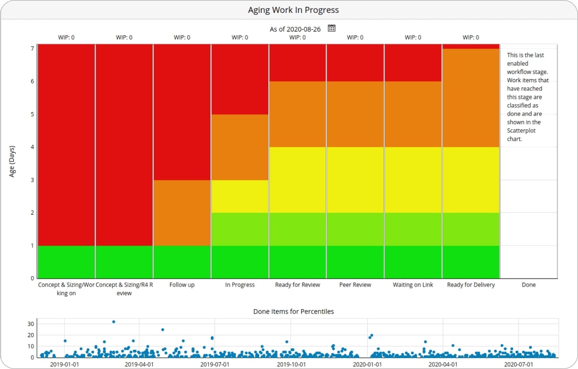 Visualizing work in progress using the Aging Work in Progress chart
 Using the Flow efficiency chart to visualize workflow efficiency
 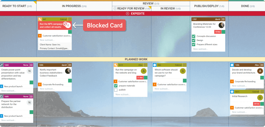 Work item blocked on a Kanban board
 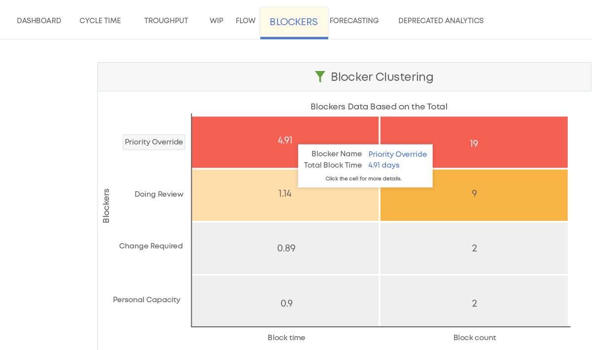 Analyzing process blockers using Blocker Clustering chart
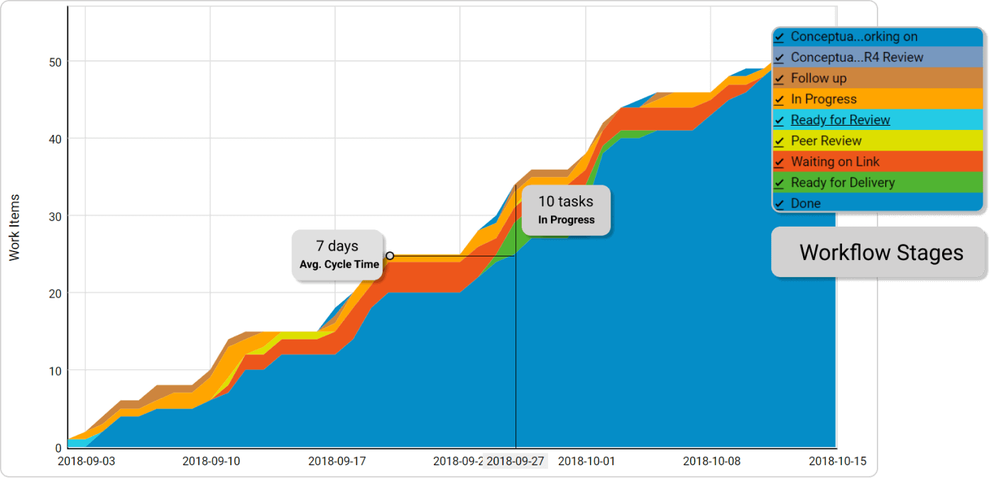 Cumulative Flow Diagram visualizing workflow stages, average cycle time, and the number of work items in progress