The scatter diagram is also called a scatter plot chart, XY chart, and correlation chart. A scatter diagram is a two-dimensional graphical representation of a set of data. The scatter diagram graphs pairs numerical data with one variable on each axis to look for a relationship between them. If the variables are correlated, the points will fall along the line or curve. The better the correlation, the tighter the points will hug the line. The scatter diagram is one of the seven basic quality tools used in root cause analysis.
Scatter diagrams are used and applied in several ways, where the most important benefit is showing the correlation between two variables. The scatter diagram will visualize in an easy to observe way if the data points are positively correlated, negatively correlated, or there is no correlation between the two variables.
There are two common challenges that come with the use of scatter diagrams – the interpretation of causation as correlation and overplotting. The most important thing to remember when we talk about correlation is that it doesn’t mean that the changes observed in one variable are responsible for the changes observed in another variable. Overplotting exists when too many data points have been plotted. This results in the different data points overlapping, making it challenging to identify the relationship between variables.
What Are Scatter Diagrams Used for?
Scatter diagrams are used when you want to demonstrate the relationship between two variables or when you have to identify data patterns. The scatter diagram is used in many sectors such as in Lean management to determine root cause analysis, in Economics to illustrate relationships between two economic phenomena, such as employment and output, in Management to visualize how product inventories affect costs or delivery times, in Market Research to illustrate, for example, the relationship between advertising methods and sales.
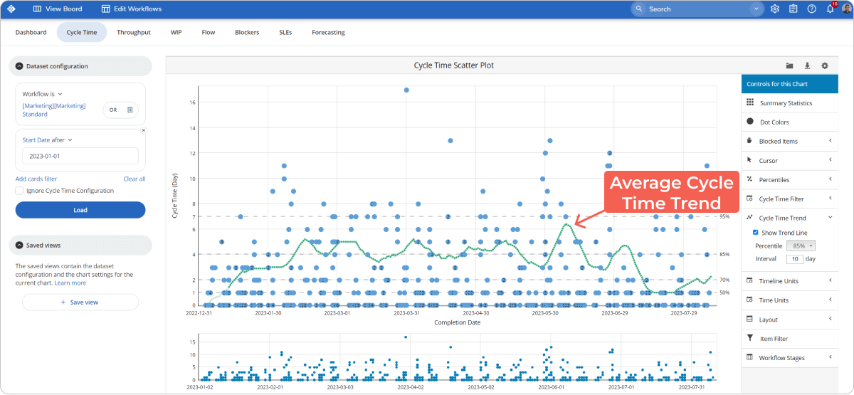
Can You Use a Scatterplot Chart to Forecast Cycle Time on a Kanban Board?
Yes, you can use a scatterplot chart to forecast cycle time on a Kanban board. In Kanban, it is called cycle time scatterplot. The cycle time scatterplot is an adapted version of the scatterplot chart. It is revered in the Lean management world because it provides a very detailed picture of one of the key metrics in Lean – cycle time. Cycle time represents how long it takes to get things done for individual items on your Kanban boards. The goal of the cycle time scatterplot is to visualize the cycle time of your team’s assignments within a predefined time frame.
The structure of this chart is very similar to that of a typical scatterplot. The horizontal axis of the chart visualizes a selected time frame by dates. The vertical one represents the cycle time of the completed tasks during this period calculated in days. Each dot that you see scattered across the chart is a marker representing a task within a card on your Kanban board. The dots’ positions are determined by the completion date and how long it is required for the Kanban card to reach the "Done" column.
What Are the Types of Scatter Plots?
You can classify a scatter plot in many ways; the most popular one is based on correlation and is extensively used in project management. According to the correlation, scatter plots are divided into the following three categories.
- Positive Correlation
- Negative Correlation
- No Correlation
1. Positive Correlation
The scatter plot with a positive correlation is also known as a "Scatter Diagram with Positive Slant." In this case, as the value of X increases, the value of Y will increase too, which means that the correlation between the two variables is positive. If you draw a straight line along the data points, the slope of the line will go up. For example, if the weather gets colder, hot drink sales will go up.
2. Negative Correlation
The scatter plot with a negative correlation is also known as a "Scatter Diagram with a Negative Slant." In this case, as the value of X increases, the value of Y will decrease. If you draw a straight line along the data points, the slope of the line will go down. For example, if the cycle time of a workflow goes up, the number of tasks completed will go down.
3. No Correlation
The scatter plot with no correlation is also known as the "Scatter Diagram with Zero Degree of Correlation." In this case, the data point spreads so randomly that you can’t draw a line through the data points. You can conclude that these two variables have no correlation or zero degrees of correlation. For example, if the weather gets hotter, we can’t conclude that the sales of wooden chairs will go up or down because there is no correlation between the two variables.
What Are the Benefits of Using a Scatter Diagram?
The following benefits can define the importance of a scatter diagram.
- A scatter diagram visualizes the relationship between two variables.
- A scatter diagram is one of the best tools to show a non-linear pattern.
- A scatter diagram provides the data to confirm a hypothesis that two variables are related.
- A scatter diagram determines the range of data flow, for example, the maximum and minimum values.
- A scatter diagram visualizes patterns that are easy to observe.
- Plotting a scatter diagram is very simple.
- A scatter diagram establishes a relationship between two sets of numerical data.
- A scatter diagram can track patterns and trends of different measures.
What Are Common Issues When Using Scatter Plots?
There are two common challenges that come with the use of scatter diagrams – the interpretation of causation as correlation and overplotting.
1. Overplotting exists when too many data points have been plotted. This results in the different data points overlapping, and it makes it challenging to identify the relationship between variables.
2. Interpreting Correlation as Causation is the second challenge of using Scatter Plots. The most important thing to remember when we talk about correlation is that it doesn’t mean that the changes observed in one variable are responsible for the changes observed in another variable. Causation is observed when an event occurring has an impact on a given outcome. Be careful not to interpret correlation as causation.
How to Make a Scatter Diagram?
There are multiple ways to create a scatter diagram. If you want to create a simple scatter diagram with one click, then the best way to do so is by using an online scatter diagram maker, which is usually free to use. You will usually have to fill in predefined fields such as the chart’s name, the Y and Y values, series value, color, and trendline. Click on the draw button, and your scatter diagram should be ready. If you need more agility and you have to create a more complex scatter diagram, you can use Excel and PowerPoint.
In order to make a scatter diagram, you will need to have some upfront data. First, collect pairs of data where you suspect a relationship. Input your data, where the x-axis information goes in the top row, and the y-axis data will go in the bottom row. Label your x and y-axes so you know what they represent. If you have the option to use color codes for each of your dependent variable’s points, choose a color for your axes, your values, and your chart title.
Can You Create a Scatter Diagram by Using a Scatter Diagram Maker?
Yes, you can create a scatter diagram by using a scatter diagram maker. A scatter diagram maker is an online tool to help you make a scatter diagram very quickly. Many of these tools are available for free, such as Alcula, MathCracker, and RapidTables. The benefit of using a scatter diagram maker is that by filling several set fields, you can quickly create a beautiful scatter diagram.
To create a scatter diagram, enter the graph’s title for the Y and X-axis, enter the minimum axis value, maximal axis value, and axis label. There are also simple scatter diagram calculators, where the only thing you need is to fill in the values for X and Y. The main disadvantage of using an online scatter diagram maker is that it lacks flexibility. You need to work with what’s offered by the tools.
What Is Correlation in a Scatter Diagram?
Scatter diagrams have one very specific purpose; they show how one variable is affected by another. The relationship between the two variables is called correlation.
If the value of X increases and the value of Y increases too, this means that the correlation between the two variables is positive. If you draw a straight line along the data points, the slope of the line will go up. If the value of X increases and the value of Y decreases, this means that the correlation between the two variables is negative. If you draw a straight line along the data points, the slope of the line will go down. If the data point spreads so randomly that you can’t draw a line through the data points, this means that the correlation between the two variables is negative.
The correlation can be quantified by strength – whether the correlation between the two variables is weak or strong. It is important to understand that the correlation provides evidence of association, not causation. When describing the relationship between two variables, correlations are just one piece of the puzzle. This information is necessary but not sufficient. Other analyses should also be conducted to provide more information.
What Are the Scatter Diagram Correlation Patterns?
- A strong positive correlation pattern is when the value of Y increases as the X value increases.
- A strong negative correlation pattern is when the value of Y decreases as the X value increases.
- A weak positive correlation pattern is when the value of Y increases slightly as the X value increases.
- A weak negative correlation pattern is when the value of Y decreases slightly as the X value increases.
- A complex correlation pattern is when the value of Y looks like it is related to the value of X, but their relationship can’t be easily determined.
- A no-correlation pattern is when there is no connection between the two variables.
How to Read a Scatter Diagram?
The data on a scatter diagram should be read from left to right, and you should be looking for trends. If you see an uphill pattern as you move from left to right, this means a positive relationship between the two variables X and Y. If X-values increase, the Y-values increase too. As you move from left to right and you see a downhill pattern, this means that we have a negative relationship between the two variables X and Y. When the X-values increase, the Y-values decrease. If the data points don’t have any kind of pattern, then this indicates that no relationship exists between the variables X and Y.
What Is the Strength of a Scatter Diagram?
The strength of a scatter diagram is quantified as weak, moderate, or strong. When the data points are spread out, the relationship between the two variables is weak. If the data points are clustered, or follow a straight line or a curve, the relationship between the two variables is considered strong.
What Are the Examples of a Scatter Diagram?
We will take a look at one example of a scatter diagram to forecast cycle time. One of the greatest benefits of using a cycle time scatterplot for Lean management is that it gives you the ability to forecast the outcome of future tasks. Although it may look confusing at first sight, the chart can give you probabilistic forecasts about future performance. For this to happen, you need to draw horizontal lines across the chart, depending on the number of finished tasks within a specific time frame.
 Scatterplot Diagram
For example, let’s say that you’ve got 100 tasks that were completed in 30 days. If 25 of them were finished in 5 days or less, while all the others took longer, you’ve got a 25 percent chance to finish any future task within this time frame. Draw a horizontal line at the height of the 10th day on your cycle time scatterplot.
Let’s say that 50 more tasks were completed within 10 days. The second horizontal line should mark 75 percent and should be at the height of the 10th day. The higher the percentile, the higher the chance to complete a future task within this time frame.
Whenever you commit to a deadline, you need to look at the percentile lines on your scatterplot and say that you’ve got a certain percent chance to be ready in X days/weeks/months.
How to Use Scatter Plot in Six Sigma?
A scatter plot is a two-dimensional graphical representation of a set of data. Its ability to show nonlinear relationships between variables is widely used in Six Sigma. Scatter plots are widely used as a tool for analyzing problems in Six Sigma.
Scatter plots show how the variables relate to each other. This relationship is called correlation, and there are three types of correlation: positive, negative, and no correlation. In Six Sigma, a scatter plot will visually display the correlation between a problem and a cause, whether there is a positive, negative, or no correlation. This helps quality teams to evaluate which hypothetical cause has the greatest impact on a problem and which should be solved first.
What Is the History of Scatter Diagrams?
The modern scatter diagram appeared for the first time in 1833 in a study on the orbits of double stars. The study was conducted by John Frederick W. Herschel, an English scientist. It is believed that the visualization is the first published example of data points plotted on a Cartesian plan. In 1886, the usage of the scatter diagram in the scientific community was popularized by Francis Galton, an English Victorian-era polymath. Galton is one of the creators of the statistical concept of correlation. Before 1906, the scatterplot was commonly referred to as a scatter diagram; however, Karl Pearson, an English mathematician and biostatistician, is credited with naming the visualization as a scatterplot. In the 1980s, the chart was further popularized by the statisticians William Cleveland and Robert McGill. They conducted research to understand which charts people perceive information most quickly and accurately. The scatter diagram was the big winner as people are extremely experienced at looking at many points on a chart and understanding their relationship.
We offer the most flexible software platform
for outcome-driven enterprise agility.
In Summary
A scatter diagram is a correlation chart that visually depicts the relationship between two variables. It provides insights into how two variables affect each other when they are plotted over a graph. Some of the benefits of scatter diagrams include:
- Visualization of the relationship between two variables.
- Visualization of patterns and trends that are easy to observe.
- Easy-to-use plotting mechanism.


 Scatterplot Diagram