In this Kanban tutorial, you will learn how to measure, track, and improve teams’ performance.
And remember, there is always a better way.
-
Audience: Users looking to understand the Kanban metrics and learn how to use our platform's Analytics module
-
Prerequisite: You have your Kanban board set up.
-
Why Kanban Metrics?: Tracking them allows you to measure your workflow’s performance, optimize it for stability, and eventually make it more predictable.
Step 1. Lead and Cycle Time - How Long Does It Take to Complete Work?
Measuring and analyzing lead and cycle time can help you learn how value flows through your system. With this data, you can discover the flaws of your workflow and make improvements continuously.
Hint: Cycle time begins when a new task enters the “In progress” stage, and somebody is actually working on it. Lead time is the period between a task’s appearance in your workflow and its final departure from the system. In Businessmap, you can measure these essential metrics with various tools. Let’s take a look at the Cycle Time Scatterplot.
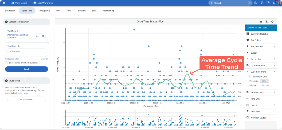
1.1 Use the Cycle Time ScatterPlot
The green line on your Cycle Time Scatter Plot (see the image below) shows you the average cycle time of all tasks that went through your system in a given period.
In the example below, the average cycle time is two days.

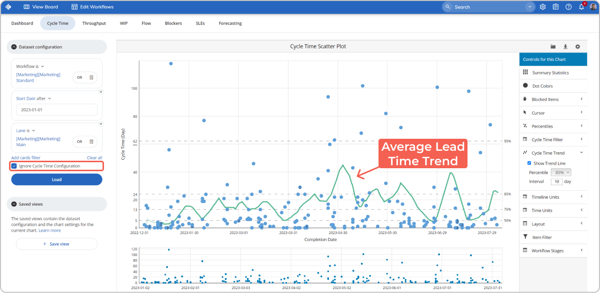
However, you can enable the function “Ignore Cycle Time Configuration” to see the tasks’ average lead time and better understand your flow.
This change in the settings will allow you to add to the calculation the time tasks spent in the “Requested” area and also in all waiting columns (e.g., Waiting for Review) of your workflow.
Continuing with the example above, when we include the “Requested” column, we clearly see the average lead time slightly differs from the cycle time in the previous image.
The new calculations show that at some point, the average lead time reaches 23 days, while the average cycle time for the same period is 2 days. This could signal some of your tasks spend too much time in the “Requested” section or that they have been blocked for a while.
Another benefit of the Cycle time scatterplot is that it lets you easily identify all tasks that took longer than the average to complete. They are placed above the cycle time trend line.
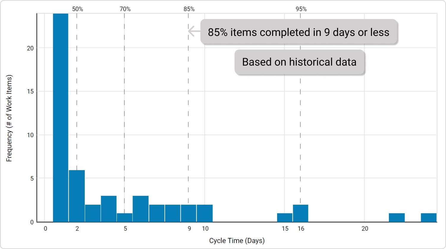
1.2 Measure Process Predictability with Cycle Time Histogram
A predictable process allows a shared sense of feeling comfortable when committing to new work and forecasting delivery. In other words, it is much better to know what amount of tasks your team can finish within a certain period.
Based on your workflow’s historical data, the Cycle Time Histogram gives you an overview of how fast tasks flow through your system.
Based on the data you see on the image above, you can say to your clients, a single task needs 9 days for completion on average and predict with high certainty the overall length of projects. This can make your process much more predictable and stable.
Step 2. Throughput - What Amount of Work Can You Finish for a Day or Week?
Every company wants to know how to measure teams’ productivity to make reliable predictions. If you ever used Kanban, you know throughput is the right metric here.
Let’s explore how the Throughput Run Chart can help you.
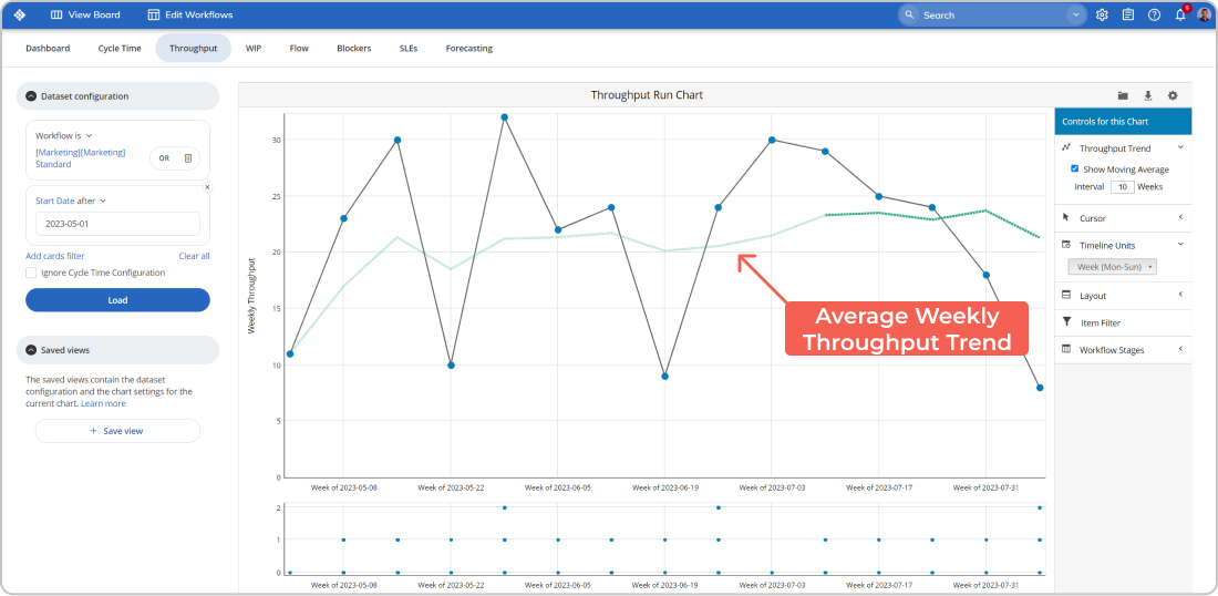
Throughput Run Chart - How much work can you deliver?
The throughput data gives you a better overview of how productive your team is, as it shows how much work they deliver on a daily or weekly basis.
Looking at your Throughput run chart, if you see a stable trend, that means your team can consistently deliver projects/work to the customers.
Let’s have a look at the following example.
Here, we configured the graph to show weekly throughput for a range of nearly 3 months. The green line shows how much work your team is delivering weekly on average. In this particular case, it is around 15 work items per week. With such data, next time a client request comes in, you can accurately calculate the amount of time your team needs to finish that project.
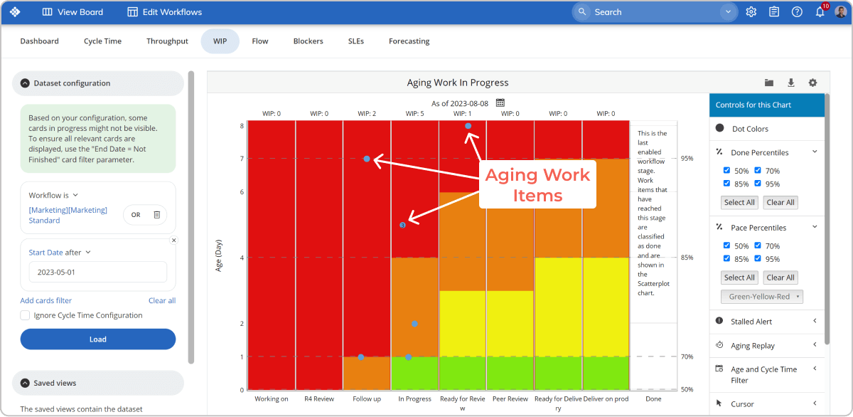
Step 3. Aging WIP - When It Takes Ages to Complete a Task.
You know how sometimes it takes ages to complete certain work items. It is inevitable, and it happens in every team. Often when you notice such tasks, it is already too late, and their cycle time is already enormous. There are different reasons for this - you don’t have an overview of the tasks; no one is alarming until it becomes critical, and so on.
In Businessmap, however, you can use the Aging WIP chart to tackle such issues.
Basically, this chart shows the work items currently in progress and tasks whose cycle time is higher than the average for the flow’s current work stage. In other words, you can identify in which stages of your workflow tasks are taking more time than usual.
Without going into in-depth details, every task in the red zone requires special attention and analysis. The more tasks in the red area, the slower your teams are.
It is beneficial to use this chart daily or weekly to detect aging tasks on time and make them flow faster.
Step 4. How to Optimize the Efficiency of Your Teams?
We all want to know how we can deliver customer value faster and be more efficient.
What usually holds your team back from being more efficient is the waiting time or when a task is waiting to proceed. It accumulates delays that don’t make your customers happy.
10 Years Kanban Experience In 1 Free Book.
Project Manager's Guide to Kanban
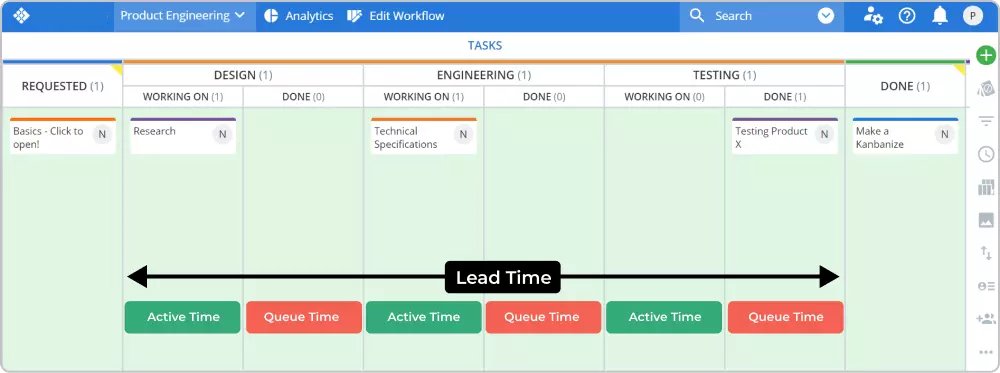
To tackle this problem, Kanban suggests measuring and managing Flow efficiency.
Hint:
Flow Efficiency[%]=Active Time/Lead Time*100Essential prerequisite!
To measure your workflow’s efficiency, you have to visualize your workflow’s waiting stages/queues on your Kanban board.
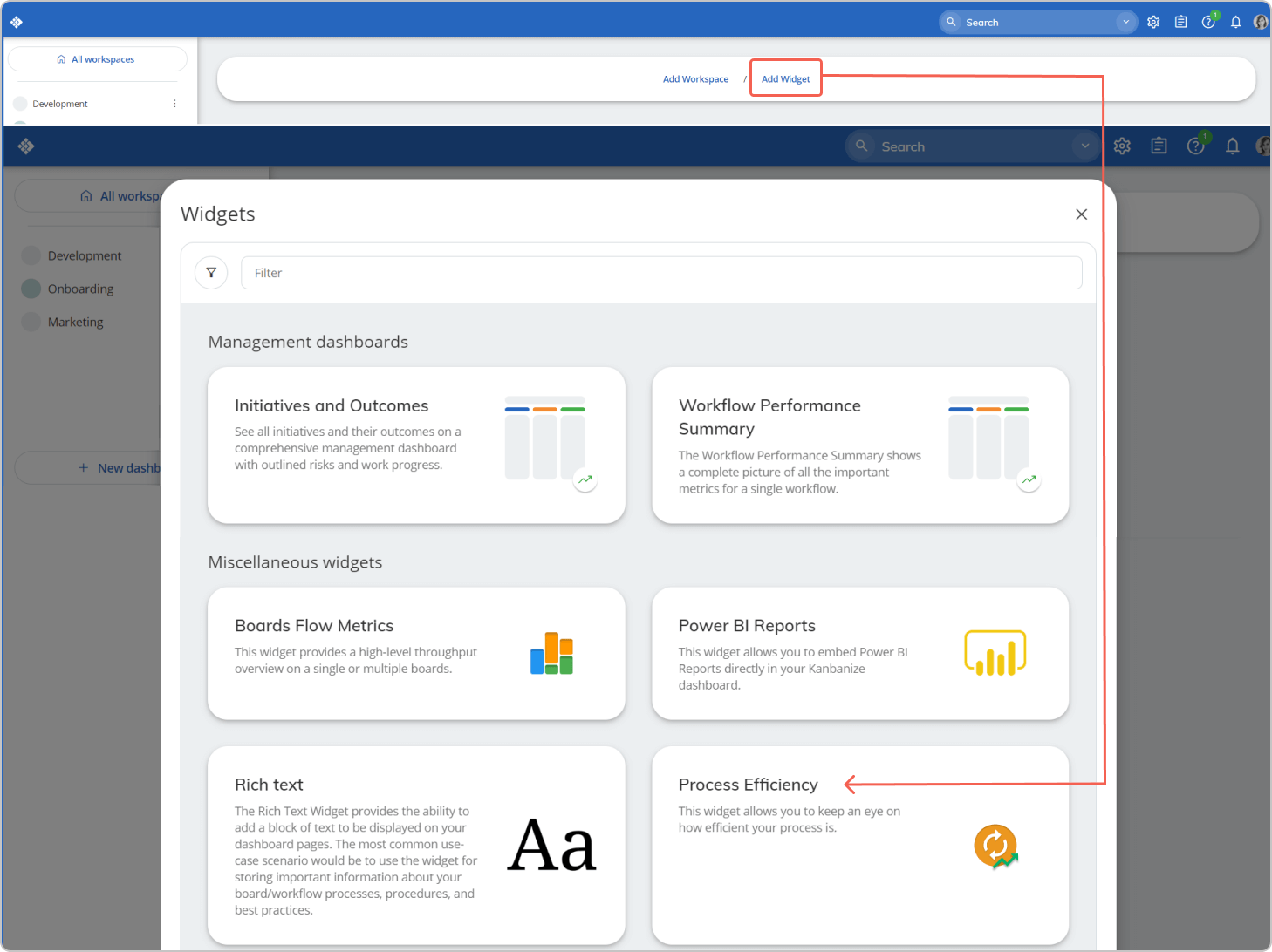
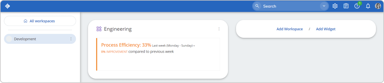
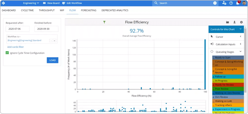
In our software platform, you can see the process efficiency of your workflow directly on your Dashboard. The only thing you have to do is add this widget from the lower right corner.
When you enable this powerful tool, you will see it on the Dashboard, as shown in the image below.
However, to acquire a precise calculation, you have to configure the active columns and the queue columns on your board. You can do this in the workflow editor.
Adjust the settings for each column to get valid data. It is worth doing it. It takes no more than 10 minutes, but then it saves you tons of time.
If you decide to use the Flow efficiency chart, you can define your workflow's queueing stages on the right side of the screen. If your flow efficiency decreases, this would probably mean that tasks are accumulating too much waiting time.
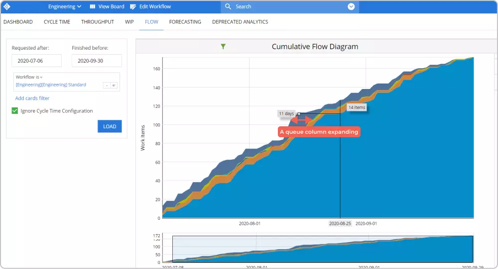
Use the Cumulative Flow Diagram
This is considered one of the most powerful analytics tools in the Kanban world. The CFD shows you how stable your flow is and helps you discover bottlenecks in your work process.
Hint: The chart tracks and accumulates each task that has ever entered and flowed through your Kanban board. The different colored bands represent the different stages of the workflow.
If the bands are widening, it means that the tasks in the current stage are taking more time to proceed - a signal for a potential bottleneck in your process.
If a band representing a queue state is expanding, that signals too many tasks are waiting to be processed. This means your team is probably struggling with demand. In this case, you can limit the number of tasks that can enter this queue to alleviate the bottleneck. However, it could also mean that you need extra capacity.
Step 5. Project Forecasting - When Will It Be Done?
This is probably the question that every project manager wants to know the answer to. And while most methods use rough estimations that often turn to be far from reality, we help you get a probabilistic answer.
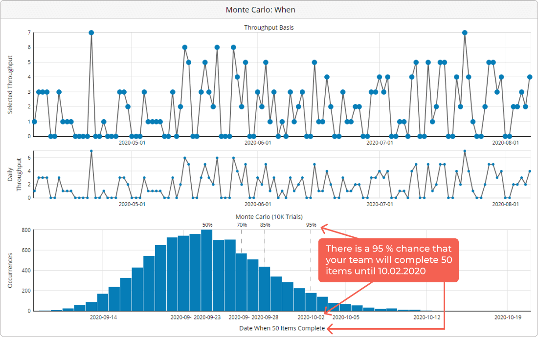
Create Probabilistic Plans with Monte Carlo Simulations
Thanks to the Monte Carlo simulations, you can get a precise forecast of when you can expect a specific number of tasks to be completed. Based on your workflow's historical data, the simulation can tell you what the chance that your team will finish X number of work items until a given date is.
And to make things even more accurate, the simulation actually gives you various forecasts with different execution probabilities.
For example, the graph above tells you that:
There is a 95% chance that your team will complete 50 items until 10.02.2020
There is an 85% chance that your team will complete 50 items until 28.09.2020
There is a 50% chance that your team will complete 50 items until 23.09.2020
It gives you a wide range of possibilities depending on how conservative you prefer to be in your prediction. In this case, if you want to play safe, you can tell a client that a project of 50 tasks will be completed by 10.02.2020 (95% chance). If you want to risk, you can try with the option where 50 tasks will be completed by 23.02.2020 (50% chance)
There Is Much More
This article hardly scratched the surface of what you can actually achieve with these powerful tools. So, keep on digging and remember that there is always room for improvement. We advise you to constantly monitor your workflow data and make small improvements to improve project delivery predictability. From your product account, you can access a series of in-depth video tutorials.
For more detailed information, you can check out our knowledge base.
Good luck.
We offer the most flexible software platform
for outcome-driven enterprise agility.