Do you fail to meet your SLA often? Are you having doubts before committing to deadlines? Have you had trouble delivering value at predictable intervals? If the answer to any of these questions is yes, you will definitely benefit from applying a cumulative flow diagram to your process.
Adopting a Kanban board and visualizing every step of your process is a good first step, but you need to understand that the board itself and the Kanban cards alone are far from sufficient to achieve a stable process.
Thankfully, the cumulative flow diagram can be the tool in your project management arsenal that tips the scales in your favor.
What Is a Cumulative Flow Diagram?
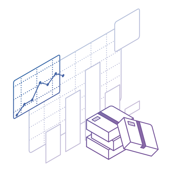
The cumulative flow diagram (also known as CFD) is one of the most advanced Kanban and Agile analytics charts. It provides a concise visualization of the three most important metrics of your Agile flow:
- Cycle time
- Throughput
- Work in progress
Its main purpose is to show you how stable your flow is and help you understand where you need to focus on making your process more predictable. It gives you quantitative and qualitative insight into past and existing problems and can visualize massive amounts of data.
How To Read a Cumulative Flow Diagram
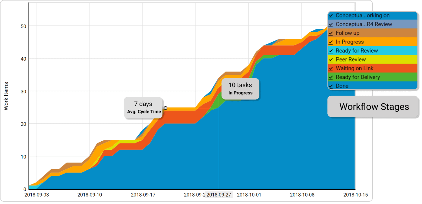
The chart tracks the total number of work items in the columns of the "In Progress" section on your Kanban board each day.

The horizontal axis of the CFD represents the time frame for which the chart is visualizing data. The vertical axis shows the cumulative number of cards in the workflow at various points in time.
The differently colored bands that divide sections of the upward flow are the different stages of your workflow as they appear on the Kanban board itself. The bands always go up or sideways in accordance with the number of assignments that go through your process.
The top line of each band on the cumulative flow chart represents the entry point of tasks in the respective stage of your Kanban board, while the bottom one shows when it leaves it. If a line becomes flat, nothing arrives in the corresponding stage, or nothing is leaving it.
Using a CFD, you can get an idea of how long your tasks' approximate cycle time is.
This is possible by measuring the horizontal distance between the top line of the first stage on the cumulative flow diagram and the bottom line of the last "in progress" stage.
The number of days/weeks/months that have passed is the approximate average cycle time of your team’s assignments for the time frame.
The distance between the lines of a CFD will show you the problems of your workflow.
Understanding the Data on a CFD Chart
You can spot whether your process is stable in just a single glance by looking at how the top and the bottom line of each band in your cumulative flow diagram are progressing.
There are three common scenarios:
The Bands Are Progressing in Parallel
This means that your throughput is stable, and new tasks are entering your workflow in parallel to those that are leaving it. This is the ideal outcome and shows that you can focus your efforts on shortening your assignments' cycle times.
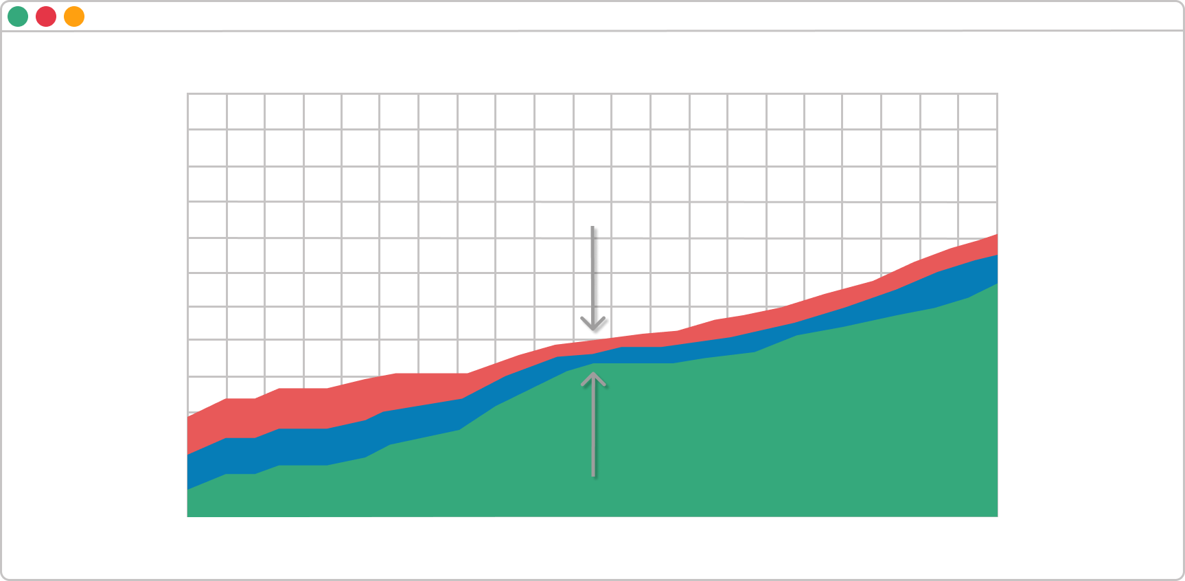
A Band Is Rapidly Narrowing
If a band on your CFD is continuously narrowing, that means that the throughput of the stage it represents is higher than the entry rate. This is a sign that you’ve got more capacity than you really need at this stage, and you should relocate it to optimize the flow.
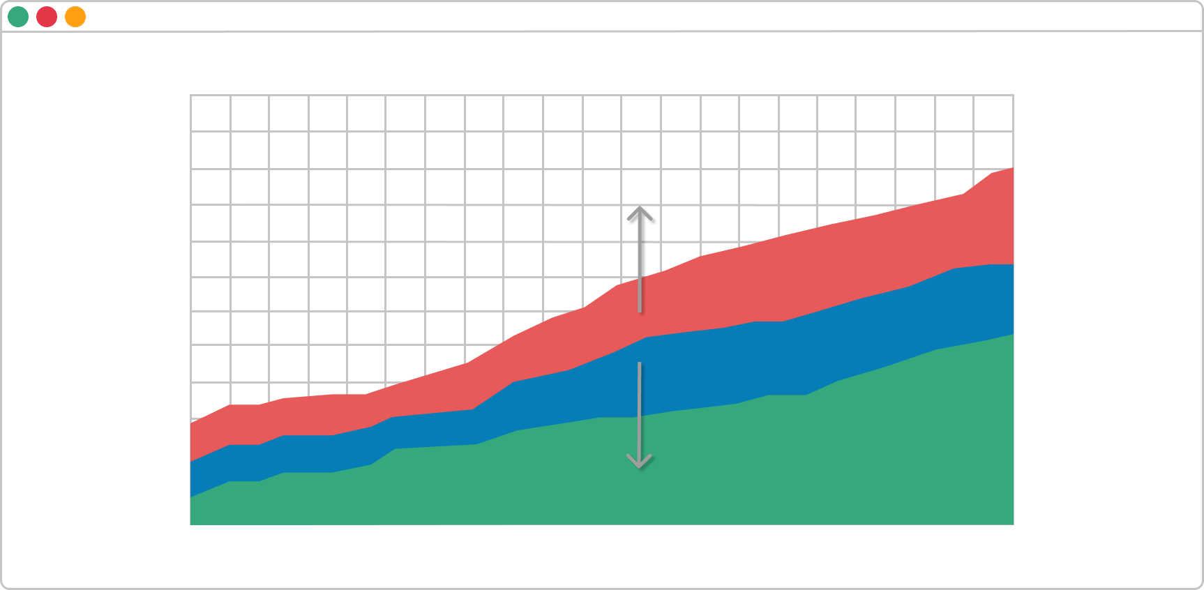
A Band Is Rapidly Widening
Whenever this happens on a cumulative flow diagram, the number of cards that enter the corresponding stage on the Kanban board is higher than the number of assignments leaving it. It is a common problem caused by multitasking and other waste activities that don’t generate value.
There are many possible actions to resolve this issue. However, if this is not generated by a dependency on external stakeholders, you should reconsider the existing WIP limits on your Kanban board and focus on finishing tasks that are in progress before starting new ones.
You should be aware of a possible 4th scenario as well – the bands are going down. If any band on your cumulative flow diagram goes down, the diagram is incorrect. A task should never disappear from your workflow.
In conclusion, the cumulative flow diagram is an advanced analytic tool that will give you an accurate picture of how stable your process is and how efficient your team is. You can get a piece of actionable advice on where you need to focus your efforts in order to improve your process in a single glance.
We offer the most flexible software platform
for outcome-driven enterprise agility.
In Summary
The cumulative flow diagram is one of the most advanced analytics in Agile project management.
- It provides a concise visualization of the metrics of flow.
- It shows you how stable your flow is and helps you understand where to focus on making your process more predictable.
- Gives you quantitative and qualitative insight into both past and existing problems.